3 Introduction to Tidyverse
3.1 Idealogy behind R for Data Science
Tidyverse is a collection of R packages that enables tools for data science, and is especially useful for data wrangling, manipulation, visualization, and communication of large data sets. Extensions of tidyverse also enable direct connections and manipulation with SQL databases (e.g, dbplyr). Here we briefly introduce some main concepts when this programming, all derived directly from the open access book R for Data Science by Garrett Grolemund and Hadley Wickham (which can be found here).
As you can read here, the main idea behind using tidyverse is that exploratory data analysis in R is composed of a few main steps: first is importing and tidying data, then iteratively transforming, visualising, and modeling data to understand patterns held by them, and finally communicating results effectively. Tidyverse was designed as a programming method and collection of functions that are focused on easing these tasks into a simple uniform routine that can be applied to any dataset. Standardizing the approach taken toward any data science project then aids reproducability of any project as well as the ability to collaborate on a project.
3.2 The foundation: tibbles, tidy data, and piping
3.2.1 Tibbles
First we need to install and load Tidyverse. After that we can have a look at what at the main form of data storage, called a tibble:
Note that a tibble is essentially the same as a data frame (for example made with data.frame) but with some useful information printed (e.g., dimensions and data types), as well as some restrictions placed on how it an be manipulated. These help prevent common errors. For example, recycling is possible as it is in data frames but less flexible:
3.3 Tidy data
In addition, the above data may look like a standard data set obtained from anywhere, but it is not. It has already been formatted as ‘tidy data’. Although data can be represented a variety of ways in tables for visualization, but for data manipulation and analysis, there is only one format that is much easier to use than others. Therefore, all data should be transformed into this format before analyzing. This format is called the ‘tidy’ dataset in tidyverse, and following three rules make a dataset ‘tidy’:
- Each variable must have its own column.
- Each observation must have its own row.
- Each value must have its own cell.
If, for example, the flights dataset were organized such that each carrier, origin, or dest had their own sets of columns, the data would no longer be tidy.
3.3.1 Piping
In base R programming, functions wrap around the objects that they are applied to, which are often indexed, and this manipulated object is saved as a new one. What is written is arranged like an onion: in the following example, the first step of the command is in the center of code (calling the object flights), followed by indexing the 15th and 16th columns. As we move away from the center, a function is applied, and finally the output of that function is assigned to a new object.
Piping, or using %>% to pass objects from one function to the next, introduces a
programming method that makes the process more intuitive by alligning the code with the
order of operation:
flights %>%
  select(15, 16) %>%  # or use select(air_time, distance)
  apply(., 2, mean, na.rm = T) -> sub
In the above code, the flight tibble was piped into the ‘select’ function, which indexed
its 15th and 16th rows only. Select does not require an argument where flights is
referenced because it was built to accept a piped argument implicitly. Note that
selecting by column name (no quotations needed) is also possible and
more useful in most cases. After being piped to ‘select’, the result was then piped to
the function apply. Apply is an older function that is not built to implicitly
accept piped objects; therefore, it requires the placeholder . to be placed
where the input data frame is expected. Finally, this modified data frame
is assigned to ‘sub’ at the end, but alternatively it could have been assigned at the
beginning as in the non-piped version.
3.4 The power of tidyverse: all you need in a handful of functions
As in the select function, there are a variety of functions that come with the
tidyverse package, but only a small set are needed to do almost any kind of data
wrangling that you ever wanted to do. These are the only functions we touch on in this
brief introduction. However, beyond tidyverse, there are also a variety of
packages that implement more advanced piping-compatible functions that speed the
manipulation of large data sets in particular (e.g., dbplyr, purrrlyr).
The most commonly used tidyverse commands, with a brief description, include:
- select() - select columns
- filter() - retain rows according to boolean criteria
- arrange() - sorts data
- rename() - renames existing columns
- mutate() - writes new columns
- group_by() / ungroup() - groups data according to column values (such as factors)
- summarise() - reduces dataset to an aggregated leve. Used after grouping (which defines the aggregation level) and along with functions that define how to aggregate (e.g., count(), n(), sum(), mean()).
- gather() / spread() - converts data between the
wideandlong(tidy) formats - full_join(), left_join(), etc. - joins data contained in two data frames according to certain criteria that define how rows are compatible (i.e., joining in relational databases)
Below is an example of how the function apply in the previous example can be replaced
using tidyverse commands, as well as functions such as aggregate using group_by and summarise
  flights %>%
  select(air_time, distance) %>%
  summarise(mn_airtime = mean(air_time, na.rm = T),
            mn_distance = mean(distance)) %>%
  present_table() #this last line not necessary - helps with printing to web page
# or if the operation should occur by groupings:
flights %>%
select(dest, air_time, distance) %>%
group_by(dest) %>%
summarise(mn_airtime = mean(air_time, na.rm = T),
mn_distance = mean(distance)) %>%
present_table() #this last line not necessary - helps with printing to web page## `summarise()` ungrouping output (override with `.groups` argument)Here is a smattering of demonstrations on how to use the other important functions and their equivalents in base R:
3.4.0.1 filter()
3.4.0.2 arrange()
o <- order(flights$distance)
flights[o,c('year','month','day','distance')]%>%
present_table() #this last line not necessary - helps with printing to web pageflights[rev(o),c('year','month','day','distance')]%>%
present_table() #this last line not necessary - helps with printing to web page3.4.0.3 rename()
3.4.0.4 mutate()
flights2 <- as_tibble(data.frame(flights, air_time_hr = flights$air_time/60, distance_1000m = flights$distance/1000)) %>%
  present_table() #this last line not necessary - helps with printing to web page


flights2 <-
  flights %>%
  mutate(air_time_hr = air_time/60, distance_1000m = distance/1000)
flights2 %>%
present_table() #this last line not necessary - helps with printing to web page#count() with group_by()
#this yields data in a `wide` format
flights2a <- t(table(flights[,c('origin', 'dest')]))
head(flights2a) #this last line not necessary - helps with printing to web page## origin
## dest EWR JFK LGA
## ABQ 0 254 0
## ACK 0 265 0
## ALB 439 0 0
## ANC 8 0 0
## ATL 5022 1930 10263
## AUS 968 1471 0#this yields 'tidy' 'long' data
flights2 <-
flights %>%
group_by(origin, dest) %>%
count()
flights2 %>%
present_table() #this last line not necessary - helps with printing to web pageflights2b <-
flights2 %>%
as_tibble() %>%
spread(key = origin, value = n, fill = 0)
#result in the same formats
flights2b %>%
present_table() #this last line not necessary - helps with printing to web page## origin
## dest EWR JFK LGA
## ABQ 0 254 0
## ACK 0 265 0
## ALB 439 0 0
## ANC 8 0 0
## ATL 5022 1930 10263
## AUS 968 1471 0## [90m# A tibble: 224 x 3[39m
## dest origin n
## [3m[90m<chr>[39m[23m [3m[90m<chr>[39m[23m [3m[90m<dbl>[39m[23m
## [90m 1[39m ALB EWR 439
## [90m 2[39m ANC EWR 8
## [90m 3[39m ATL EWR [4m5[24m022
## [90m 4[39m AUS EWR 968
## [90m 5[39m AVL EWR 265
## [90m 6[39m BDL EWR 443
## [90m 7[39m BNA EWR [4m2[24m336
## [90m 8[39m BOS EWR [4m5[24m327
## [90m 9[39m BQN EWR 297
## [90m10[39m BTV EWR 931
## [90m# … with 214 more rows[39m3.5 Plotting in tidyverse
Tidyverse also uses ggplot2, which is intended to simplify the process of creating plots so that data can be quickly and easily visualized as an iterative component of the exploratory analysis process. Some advantages include an clear method for translating data to visuals, having many preconfigured attributes available, and being able to build and modify previously stored plot objects without needing to recreate them. A downside is that to take advantage of the full power and flexibility of ggplot2 requires a wide knowledge of what is available as options to include in graphics, and therefore involve a long learning curve. However, the ultimate results are well worth the learning investment. For a basic explanation and cheat sheet see here.
3.5.1 ggplot: Key components
ggplot has three key components:
data, this must be a
data.frameA set of aesthetic mappings (
aes) between variables in the data and visual properties, andAt least one
layerwhich describes how to render each observation.
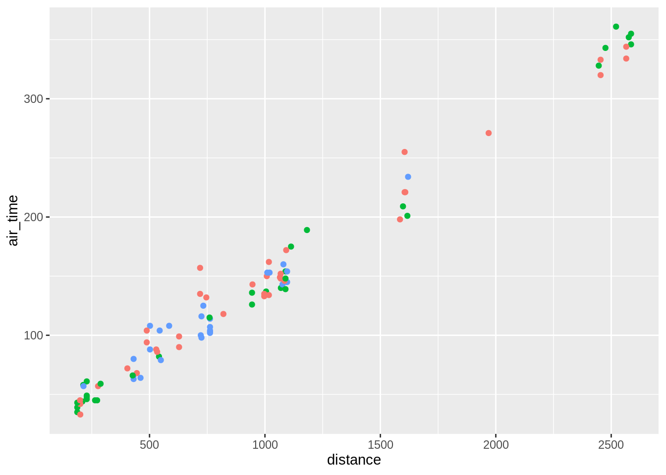
sub <-
  flights %>%
  sample_n(100, replace = F) %>%
  filter(!is.na(distance), !is.na(air_time), !is.na(origin), !is.na(month), !is.na(dest))

ggplot(data = sub, aes(x = distance, y = air_time)) + geom_point()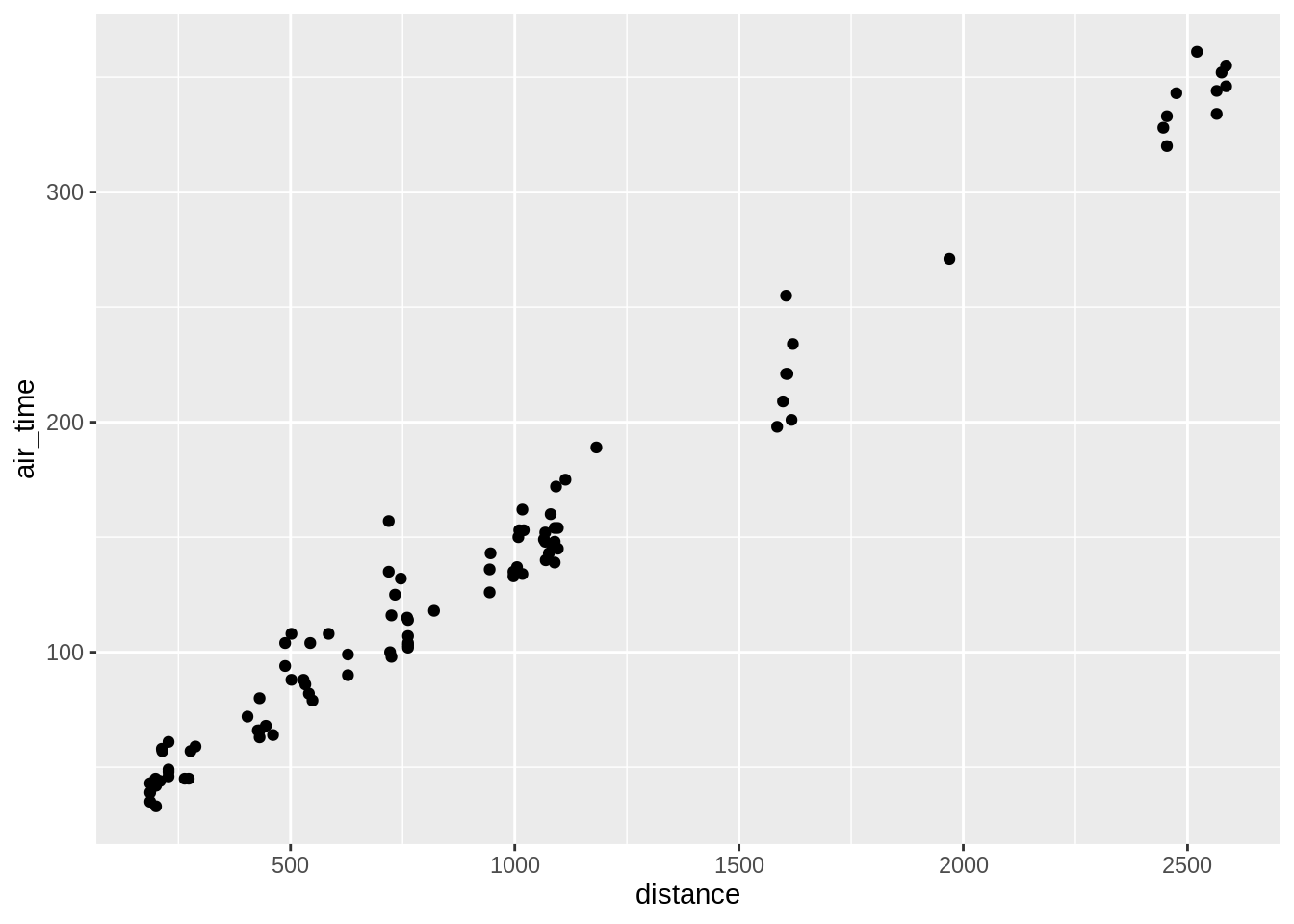
Different syntax, equivalent outcome:
ggplot(sub, aes(distance, air_time)) + geom_point()
ggplot()                    + geom_point(data = sub, aes(distance, air_time))
ggplot(data = sub)            + geom_point(aes(x = distance, y = air_time))
ggplot(sub)                   + geom_point(aes(distance, air_time))
Can be stored as an object for later use. This is a useful feature of Rgadget: because default plots are created in ggplot, they can be stored and modified by the user at a later point.
The class:
## [1] "gg" "ggplot"The structure (a bit of Latin - not run here):
3.5.2 Aesthetic mapping
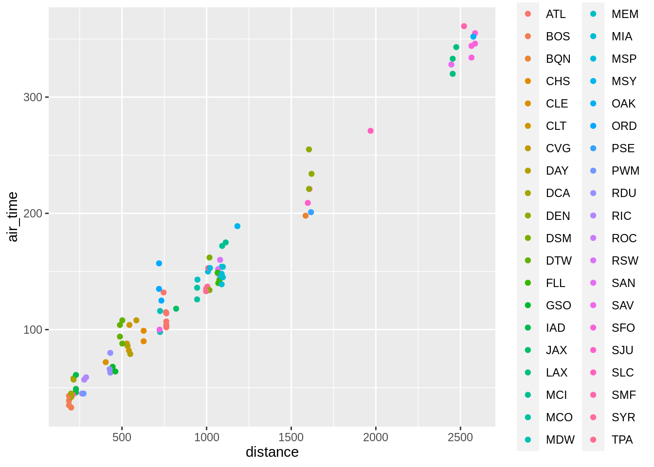
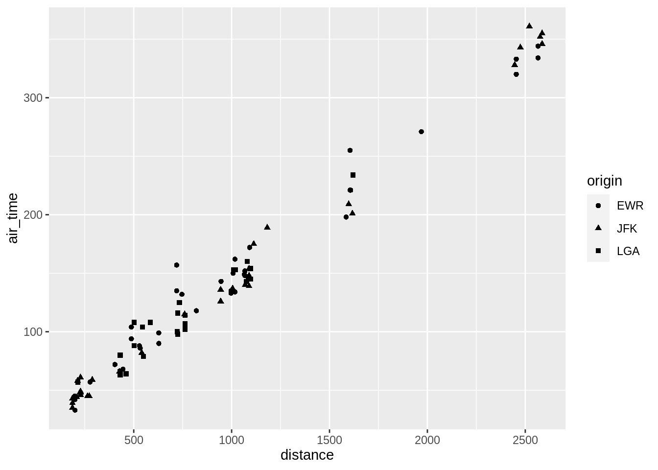
Adding more variables to a two dimensional scatterplot can be done by mapping the variables to aesthetics (colour, fill, size, shape, alpha)
3.5.2.1 colour
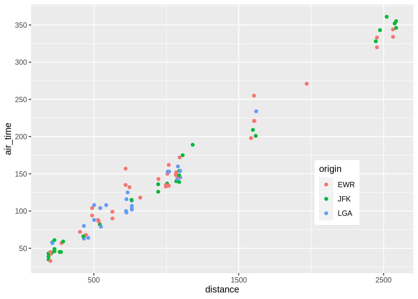
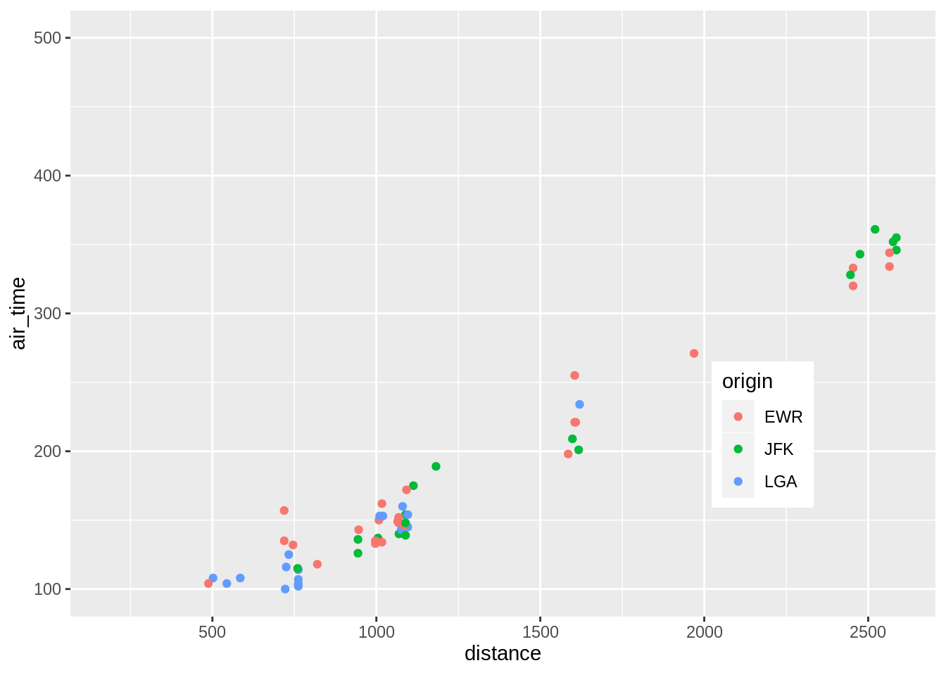
p <- ggplot(sub, aes(distance, air_time))
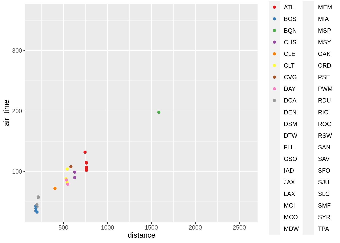
p + geom_point(aes(colour = origin))
p + geom_point(aes(colour = dest))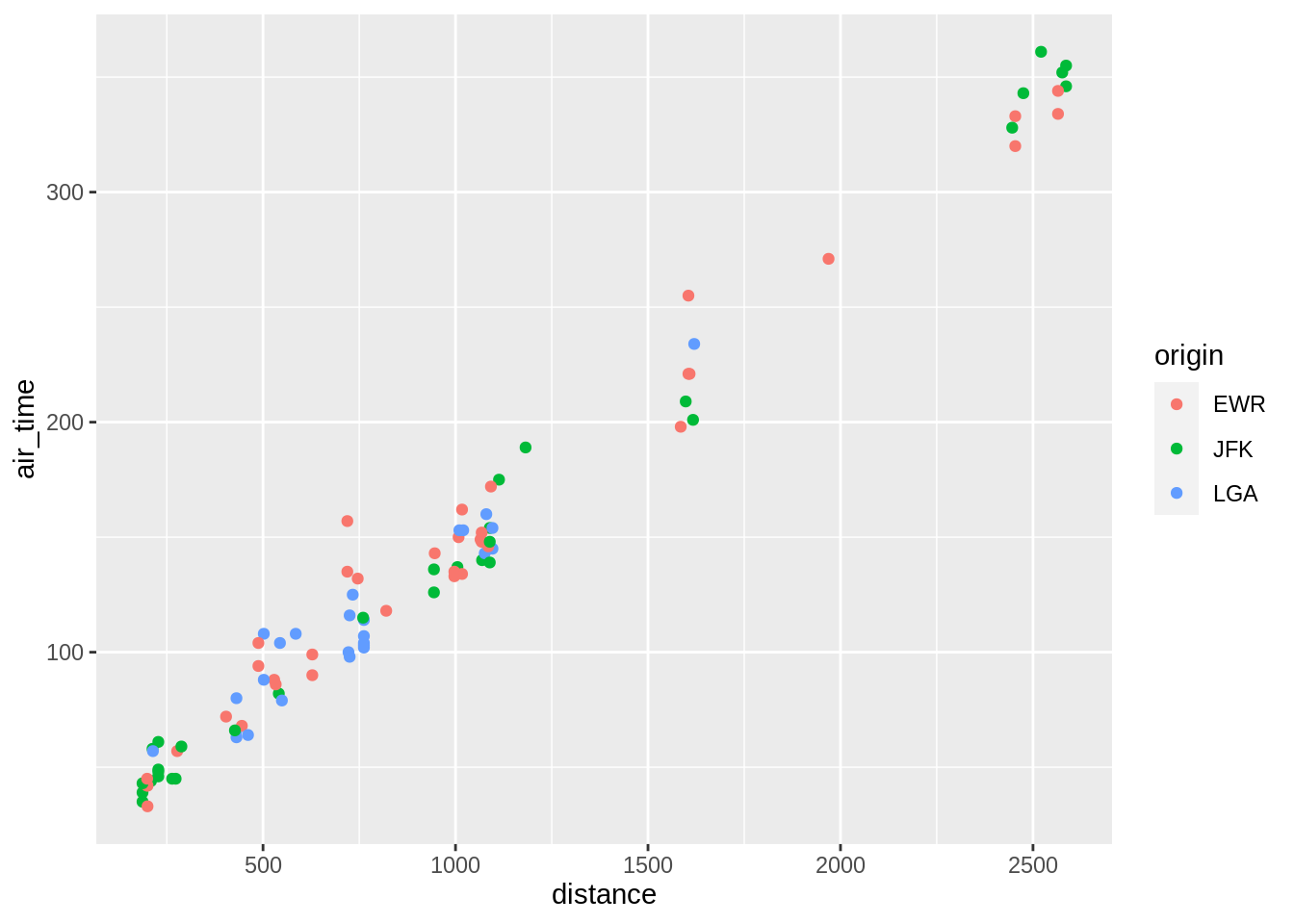
Manual control of colours or other palette schemes (here brewer):
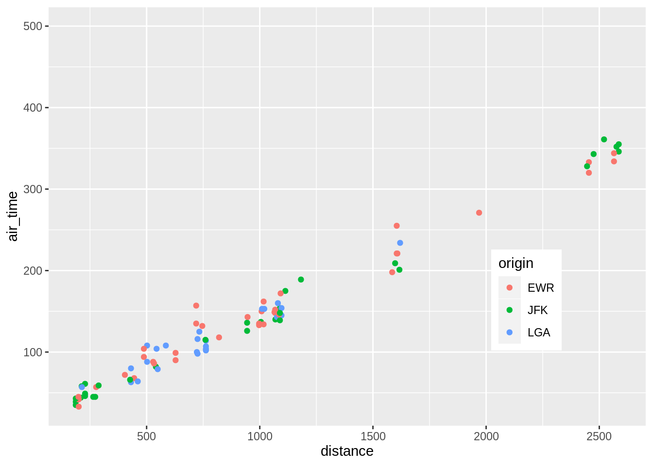
p + geom_point(aes(colour = origin)) +
  scale_colour_manual(values = c("orange","brown","green"))
p + geom_point(aes(colour = dest)) +
  scale_colour_brewer(palette = "Set1")
## Warning in RColorBrewer::brewer.pal(n, pal): n too large, allowed maximum for palette Set1 is 9
## Returning the palette you asked for with that many colors## Warning: Removed 70 rows containing missing values (geom_point).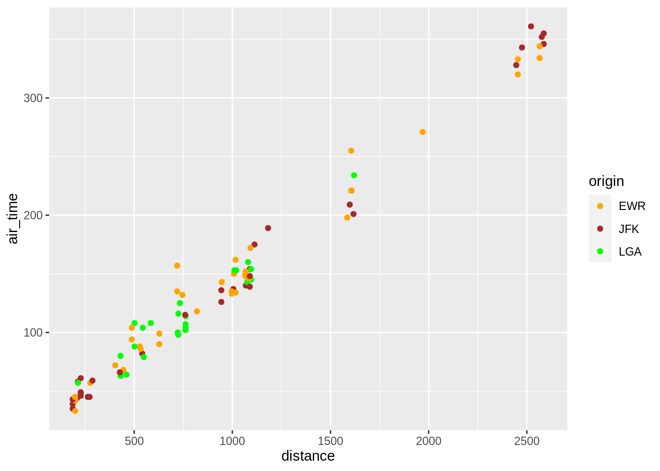
Note, to view all the brewer palettes do:
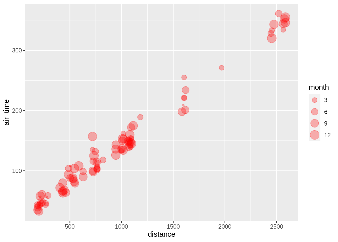
3.5.2.3 size
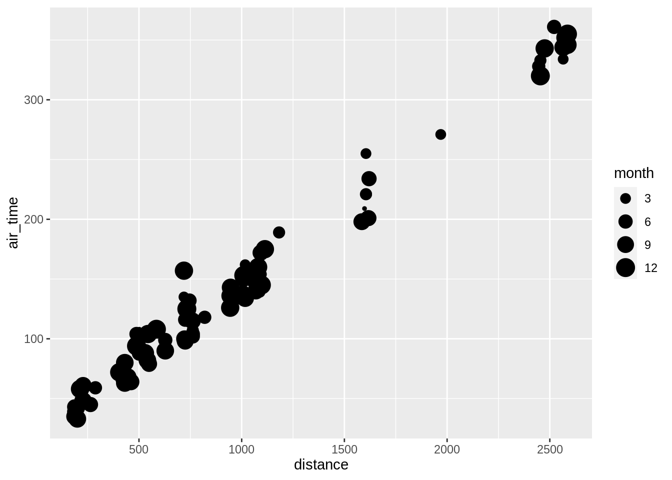
One can also “fix” the aesthetic manually, e.g.:
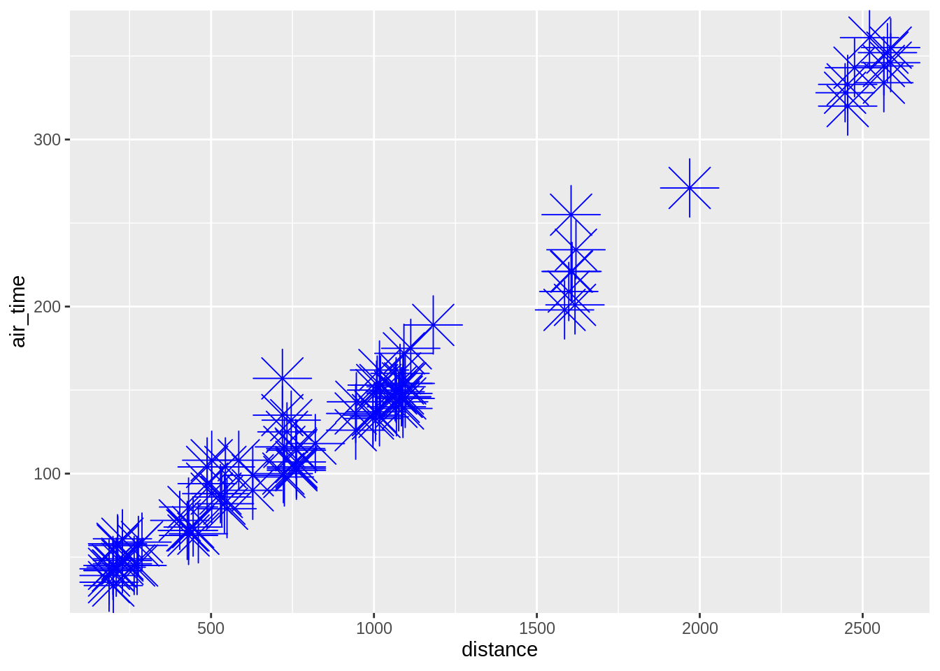
Note here that the call to colour, shape, etc. is done outside the aes-call. One can also combine calls inside and outside the aes-function (here we showing overlay of adjacent datapoints):
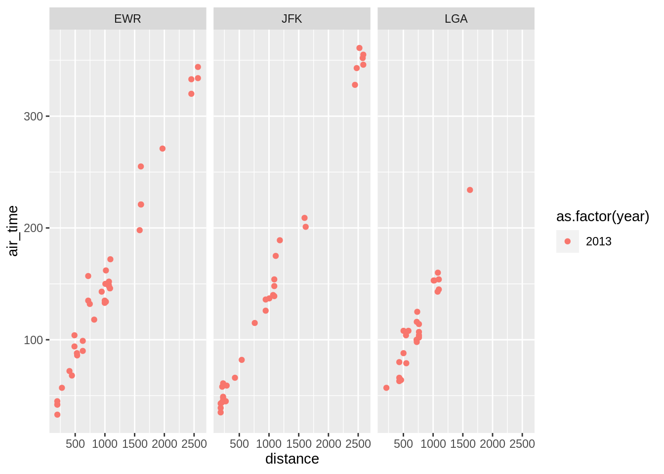
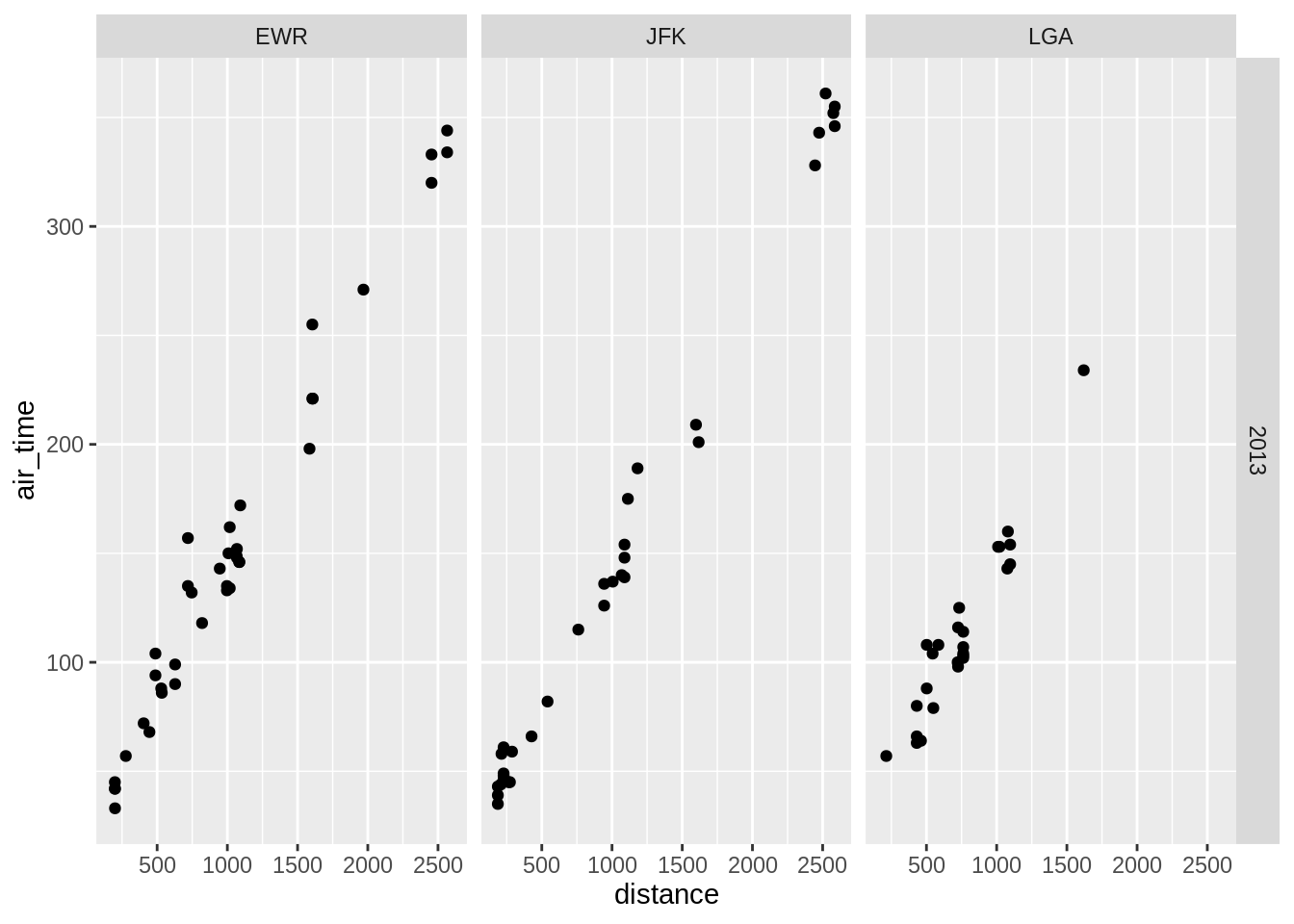
3.5.3 Facetting
Splitting a graph into subsets based on a categorical variable.
One can also split the plot using two variables using the function facet_grid:
3.5.4 Adding layers
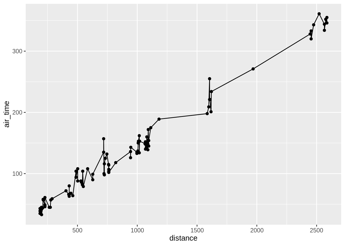
The power of ggplot comes into play when one adds layers on top of other layers. Let’s for now look at only at two examples.
3.5.5 Add a line to a scatterplot
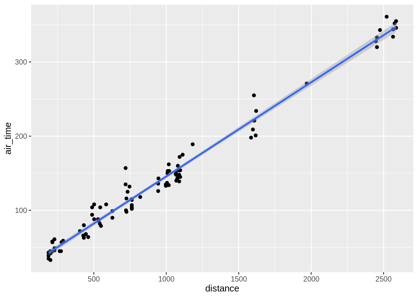
3.5.5.1 Add a smoother to a scatterplot
## `geom_smooth()` using method = 'loess' and formula 'y ~ x'## `geom_smooth()` using formula 'y ~ x'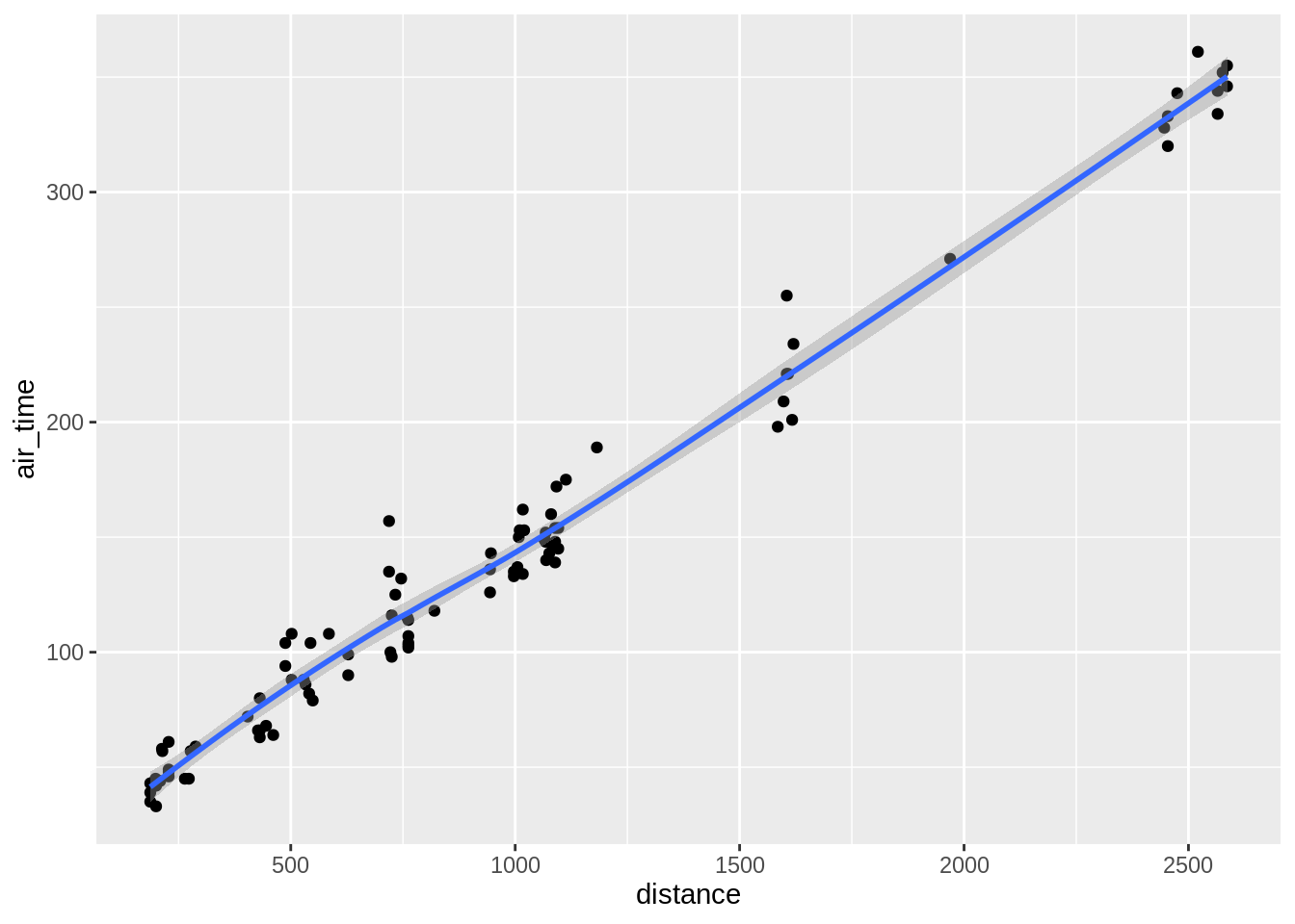
## `geom_smooth()` using method = 'loess' and formula 'y ~ x'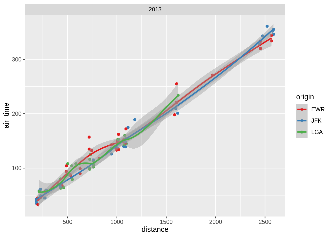
3.6 Statistical summary graphs
There are some useful inbuilt routines within the ggplot2-packages which allows one to create some simple summary plots of the raw data.
3.6.0.1 bar plot
One can create bar graph for discrete data using the geom_bar
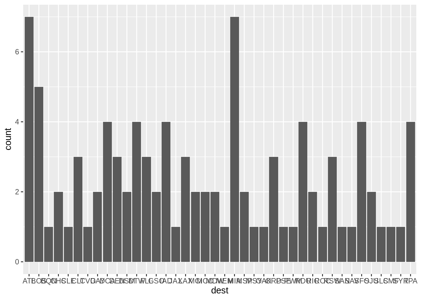
The graph shows the number of observations we have of each destination. The original data is first transformed behind the scene into a table of counts, before being rendered.
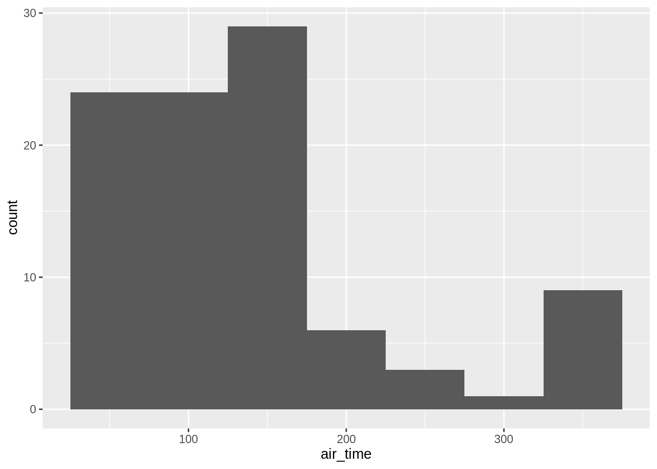
3.6.0.2 histograms
For continuous data one uses the geom_histogram-function (left default bin-number, right bindwith specified as 50 mins):
## `stat_bin()` using `bins = 30`. Pick better value with `binwidth`.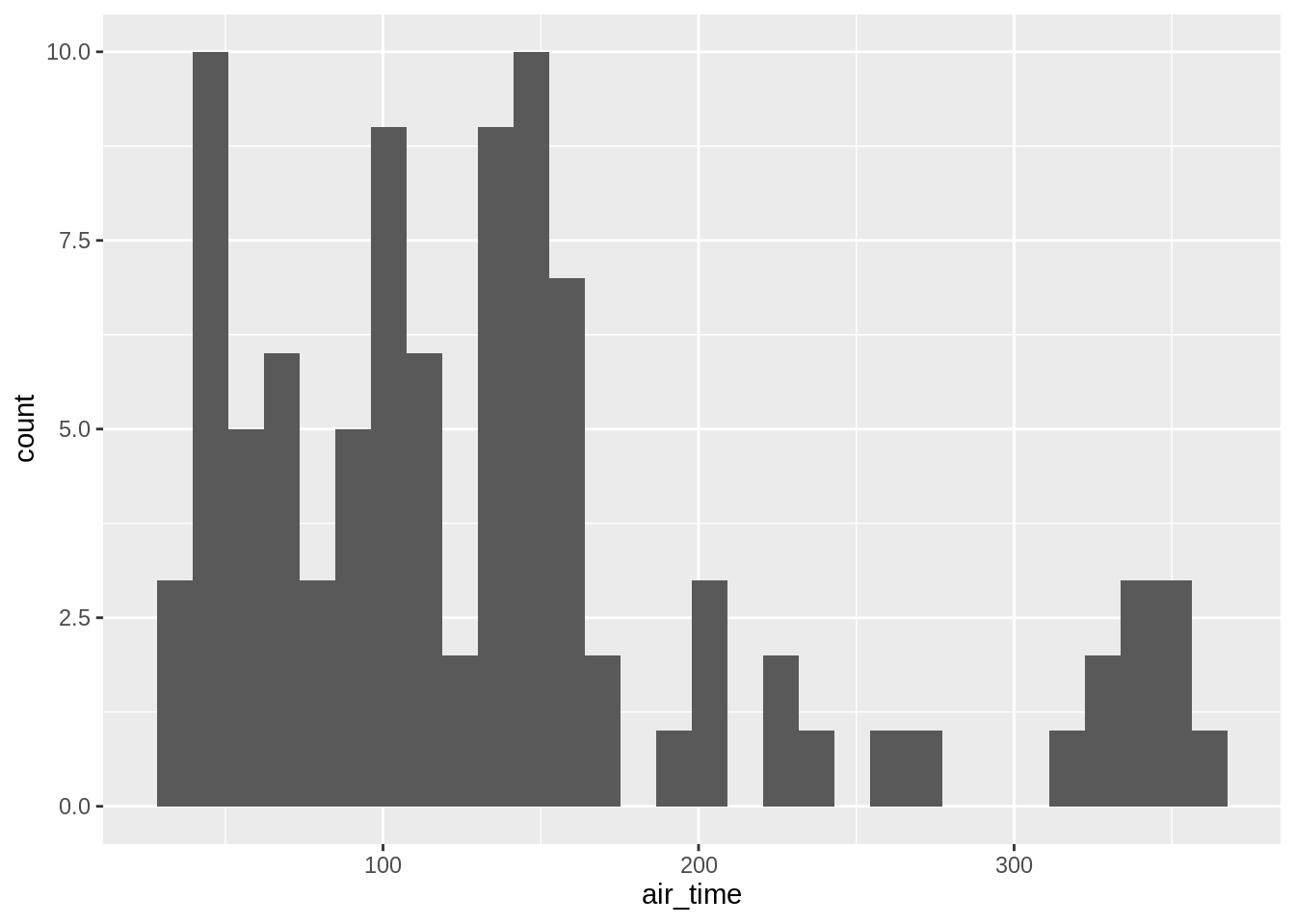
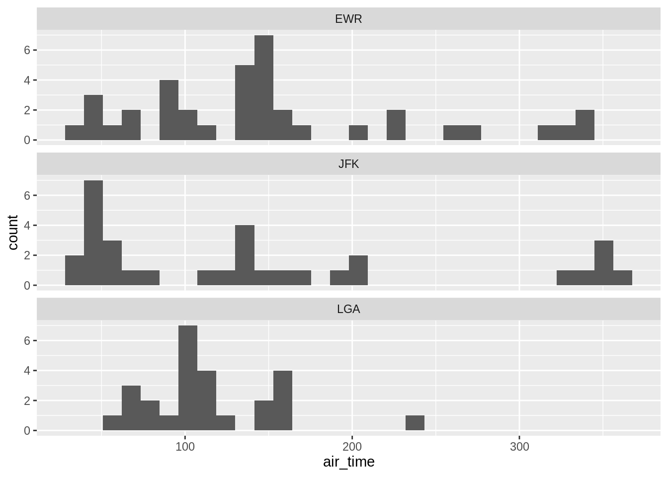
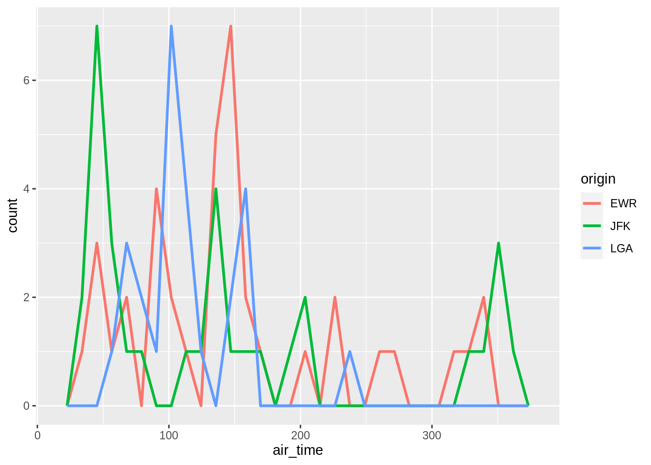
One can add another variable (left) or better use facet (right):
## `stat_bin()` using `bins = 30`. Pick better value with `binwidth`.## `stat_bin()` using `bins = 30`. Pick better value with `binwidth`.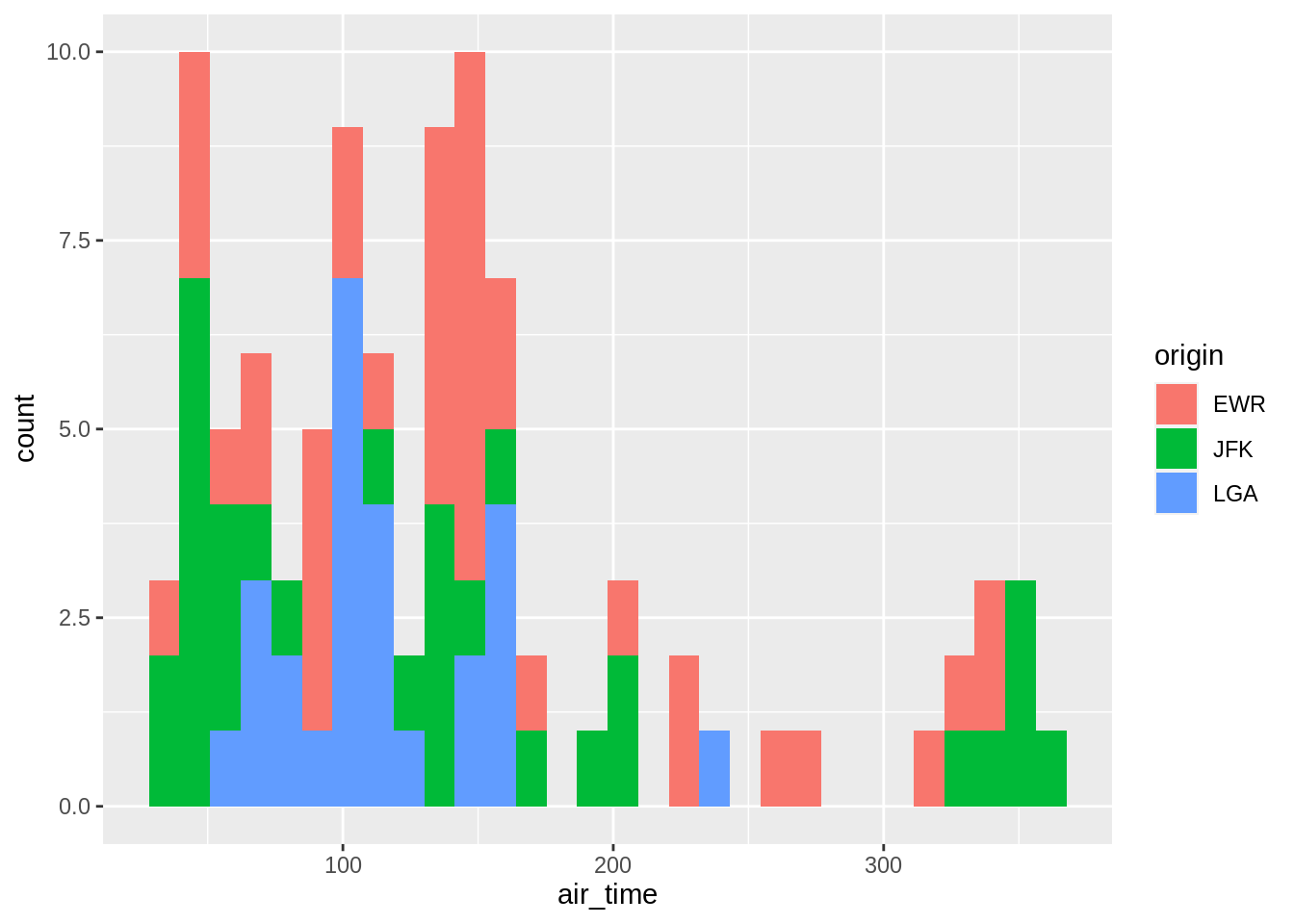
3.6.0.3 Frequency polygons
Alternatives to histograms for continuous data are frequency polygons:
## `stat_bin()` using `bins = 30`. Pick better value with `binwidth`.## `stat_bin()` using `bins = 30`. Pick better value with `binwidth`.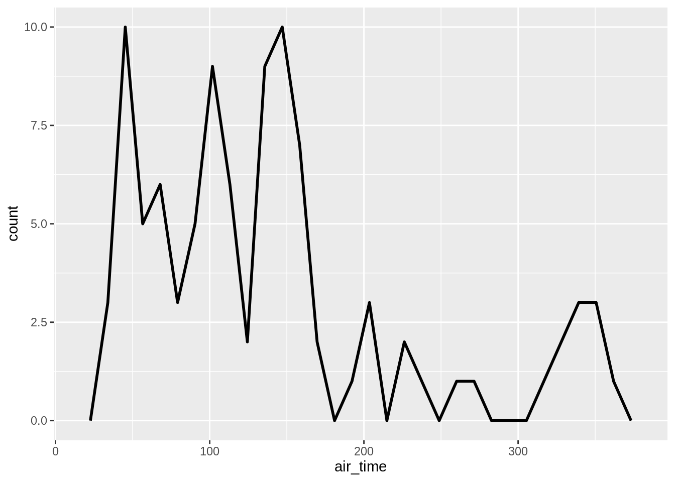
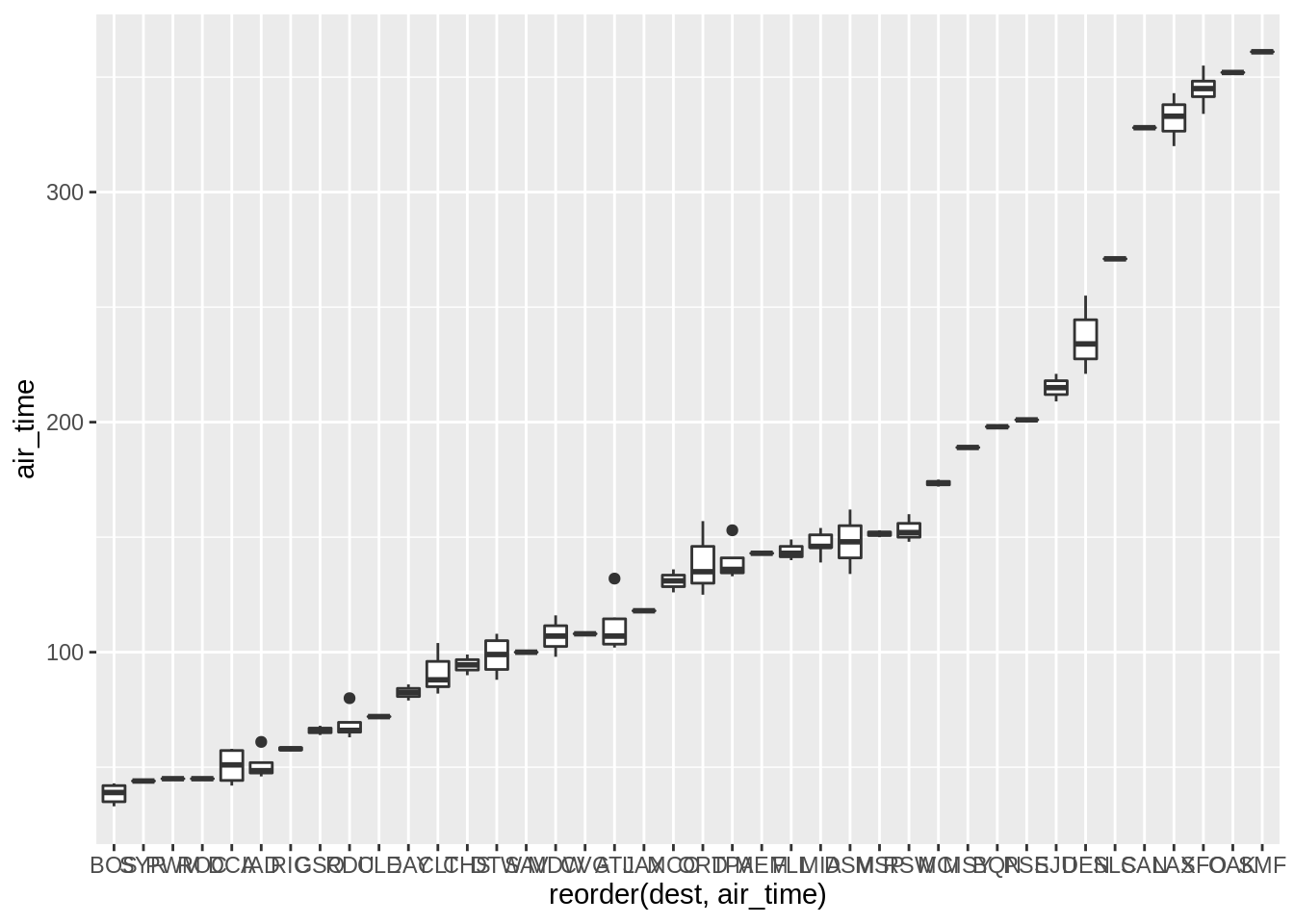
3.6.0.4 Box-plots
Boxplots, which are more condensed summaries of the data than histograms, are called using geom_boxplot. Here two versions of the same graph are used, the one on the left is the default, but on the right we have reordered the maturity variable on the x-axis such that the median value of length increases from left to right:
ggplot(sub, aes(dest, air_time)) + geom_boxplot()
p <- ggplot(sub, aes(reorder(dest, air_time), air_time)) + geom_boxplot()
p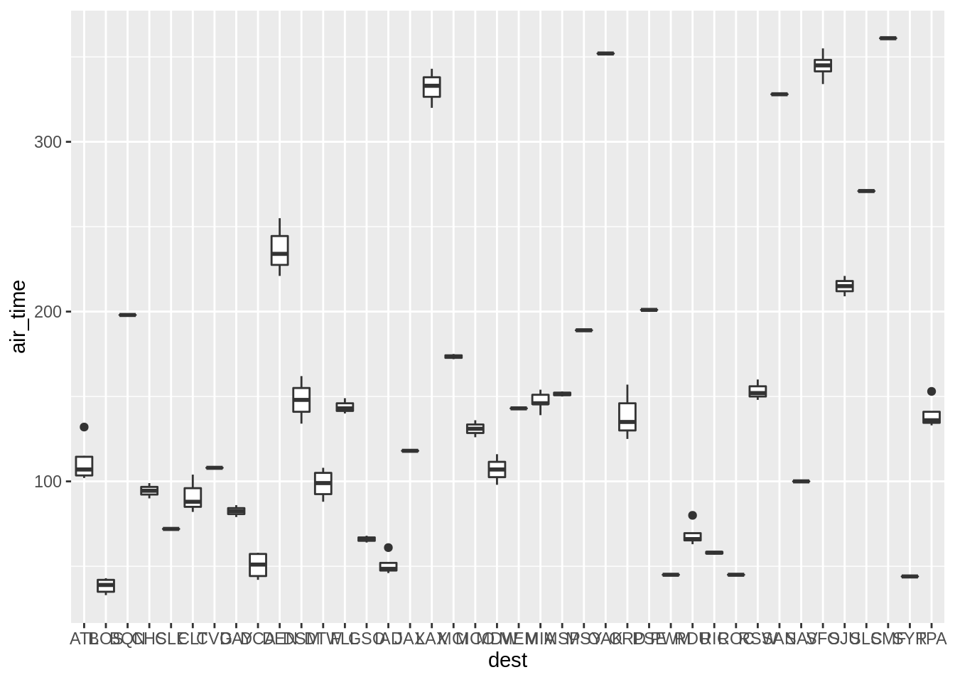
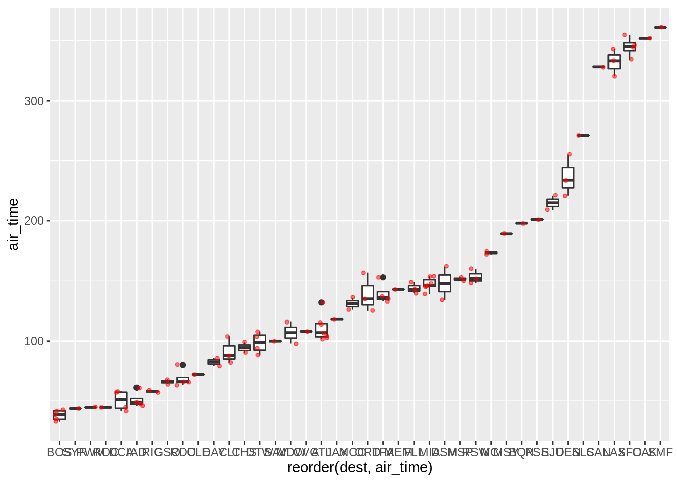
It is sometimes useful to plot the “raw” data over summary plots. Using geom_point as an overlay is sometimes not very useful when points overlap too much; geom_jitter can sometimes be more useful:
p + geom_point(colour = "red", alpha = 0.5, size = 1)
p + geom_jitter(colour = "red", alpha = 0.5, size = 1)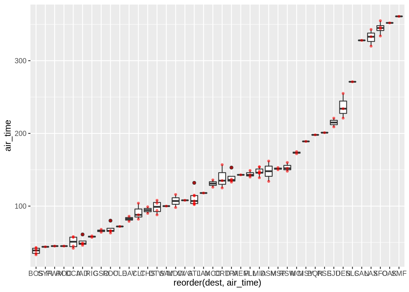
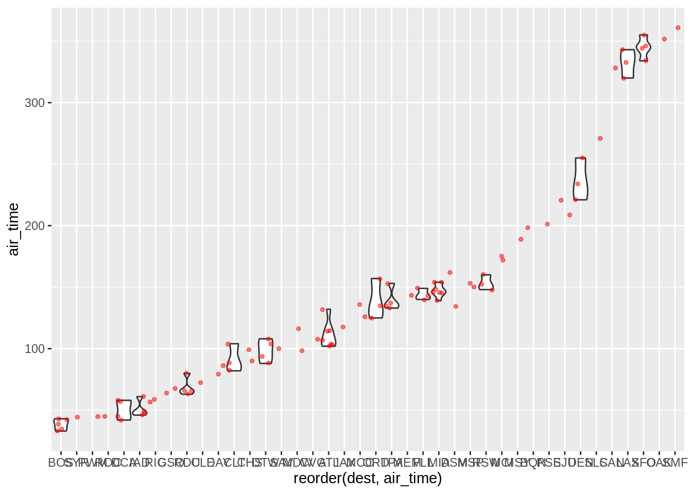
Read the help on geom_violin and create a code that results in this plot:
3.7 Other statistical summaries
Using stat_summary one can call specific summary statistics. Here are examples of 4 plots, going from top-left to bottom right we have:
- Raw data with median length at age (red) superimposed
- A pointrange plot showing the mean and the range
- A pointrange plot showing the mean and the standard error
- A pointrange plot showing the bootstrap mean and standard error
sub$distance <- round(sub$distance)
p <- ggplot(sub, aes(distance, air_time))
p + geom_point(alpha = 0.25) + stat_summary(fun.y = "median", geom = "point", colour = "red")
## Warning: `fun.y` is deprecated. Use `fun` instead.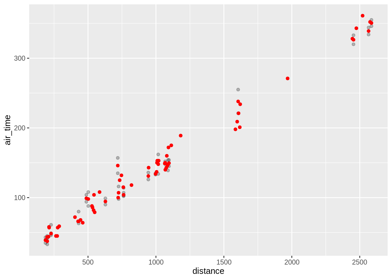
## Warning: `fun.y` is deprecated. Use `fun` instead.## Warning: `fun.ymin` is deprecated. Use `fun.min` instead.## Warning: `fun.ymax` is deprecated. Use `fun.max` instead.
## Warning: Removed 44 rows containing missing values (geom_segment).
## Warning: Computation failed in `stat_summary()`:
## Hmisc package required for this function
3.8 Some controls
3.8.1 labels
p <- ggplot(sub, aes(distance, air_time, colour = origin)) + geom_point()
p + labs(x = "Distance (miles)", y = "Air time (minutes)",
         colour = "Origin",
         title = "My flight plot",
         subtitle = "My nice subtitle",
         caption = "My caption")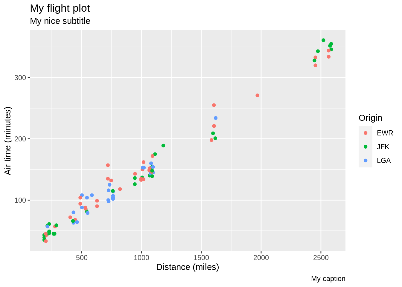
3.8.2 Legend position

3.9 Further readings
- The ggplot2 site: http://ggplot2.tidyverse.org
- The ggplot2 book in the making: https://github.com/hadley/ggplot2-book
- A rendered version of the book: http://www.hafro.is/~einarhj/education/ggplot2
- needs to be updates
- A rendered version of the book: http://www.hafro.is/~einarhj/education/ggplot2
- R4DS - Data visualisation
- R graphics cookbook: http://www.cookbook-r.com/Graphs
- Data Visualization Cheat Sheet