Plot of age composition from the model
plot_agecomp.RdPlot of age composition from the model
Usage
plot_agecomp(
  fit,
  type = "bubble",
  scales = "fixed",
  biomass = FALSE,
  base_size = 8,
  return_data = FALSE
)
Arguments
- fit
A gadget fit object. See
g3_fit.- type
Character specifying the plot type. Options:
"bar","line","ggridges"or"bubble". See Details.- scales
Character defining the
facet_wrapscalesargument to use.- biomass
Logical indicating whether biomass should be plotted instead of abundance.
- base_size
Base size parameter for ggplot. See ggtheme.
- return_data
Logical indicating whether to return data for the plot instead of the plot itself.
Value
A ggplot object.
Details
Possible plot types are:
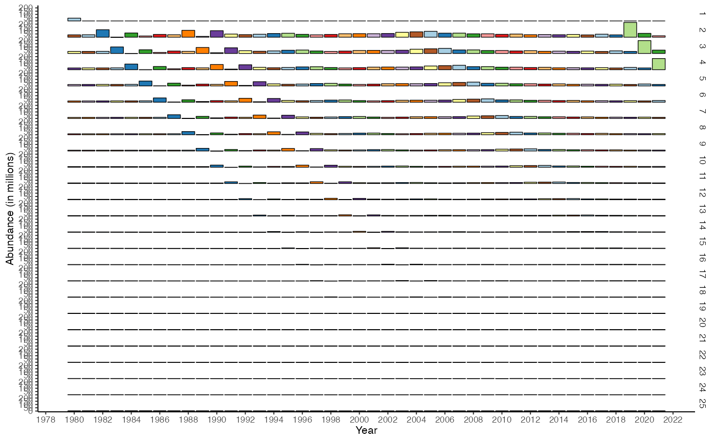
- bar
Facetted bar plot with year on x-axis, abundance on y-axis and ages along rows. Year classes are colored.
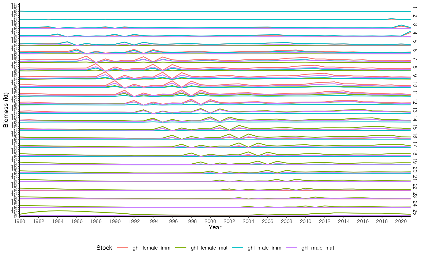
- line
Facetted line plot with year on x-axis, abundance on y-axis and ages along rows. Stocks are colored.
- ggridges
Same as above but the bars are overlapping.
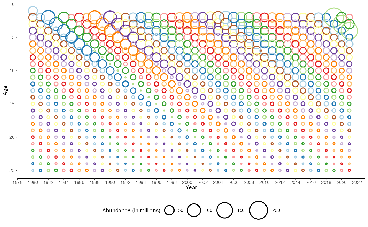
- bubble (or any other string)
Bubble plot with year on x-axis, age on y-axis and point size scaled to abundance. Year classes are colored.
Note that both "bar" and "bubble" contain extra information as text for plotly::ggplotly.
Examples
data(fit)
plot_agecomp(fit)
#> Warning: Removed 41 rows containing missing values or values outside the scale range
#> (`geom_point()`).
 plot_agecomp(fit, type = "line", biomass = TRUE)
 plot_agecomp(fit, type = "bar")
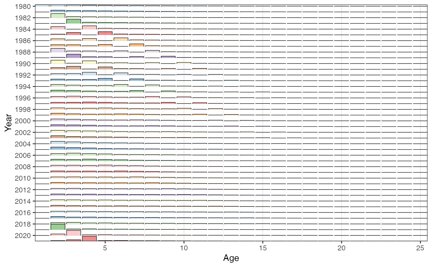
 plot_agecomp(fit, type = "ggridges")